




Estimated reading time: 6 minutes
TL;DR – Why UX in Dashboards Matters
- Data is only useful if people can understand it.
- UX designers make dashboards clearer, faster, and easier to use.
- Good UX = better decisions, more adoption, brand consistency, and accessibility.
- Tools like Power BI and Looker Studio don’t do this on their own—they need UX input.
- New EU laws make accessibility, transparency, and ethical design non-negotiable.
If your dashboards confuse users, ignore accessibility, or feel disconnected from your brand, it’s time to rethink the experience.
Introduction
Data is everywhere. Businesses are swimming in it. But the real magic happens when that data is turned into something clear, actionable, and yes—even beautiful. Enter: User Experience (UX) design. It’s the secret sauce that transforms charts and tables into insightful, intuitive experiences.
This expert view is a friendly, practical guide to how UX experts (designers and researchers) add value to tools like Power BI, Looker Studio, and other analytics platforms. Whether you’re a scrappy startup or a global enterprise, UX can elevate your dashboards to something your team wants to use.
Why UX in Data Visualisation?
Because even the most powerful data tools can fail if they confuse, overwhelm, or bore users. With UX at the table, dashboards become:
- Clearer
- More delightful
- Aligned with both business goals and user needs
Imagine this: Instead of a cluttered dashboard with 10 charts screaming for attention, you get a clean, branded, accessible, interactive story. That’s what UX does.
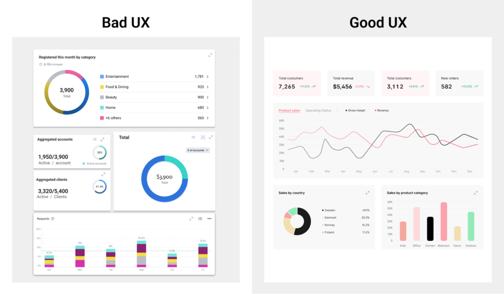
10 UX Dashboard Best Practices
1. Show the Right Data in the Right Place
Not all data is created equal, and not all of it belongs on the front page. UX designers help you focus on what matters most by asking: What is the user trying to achieve here? We remove the noise and highlight the gold. Think of it like curating a museum: you want your star pieces front and centre, not buried in a corner.
2. Bridge the Gap Between Business and Users
Often, dashboards are built with either executives or analysts in mind, but not both. A UX designer is like a translator, turning complex business requirements into simple, usable interfaces. We bring harmony to the chaos, making sure everyone from interns to C-level execs can find what they need without a scavenger hunt.
3. Use a Research-Driven Process (Not Just Vibes)
Good design doesn’t happen by accident. UX professionals use structured processes to learn what your users need and how they behave. We sketch, prototype, test, and repeat. It’s like being a scientist, but instead of a lab coat, we wear Figma and post-its. The result? Dashboards that feel like they were meant for your team.
4. Bring in Your Brand
You’ve spent years building your brand—why throw it out the window on your dashboards? UX designers ensure that your reports look and feel like part of your company. Consistent fonts, colours, and visuals make your data tools feel like home. Bonus: Users are more likely to trust dashboards that look professional.
5. Make It Accessible (For Everyone)
Accessibility isn’t optional. It’s essential. UX helps make sure that your dashboards work for everyone, including people with disabilities. That means using readable fonts, high-contrast colours, keyboard navigation, and screen reader support. We turn “I can’t read this” into “Wow, that was easy.”
6. Increase Adoption and Engagement
Let’s be honest: if a dashboard looks like a spaceship cockpit, people will avoid it. UX designers simplify interfaces, reduce clutter, and make the experience fun to use. When users like what they see, they come back. More usage = more value from your data.
7. Define UX Metrics That Matter
Design is measurable. We track real things like how fast someone finds a number, how often they use a feature, and whether they leave smiling or sighing. By setting up smart UX metrics (think task time, success rate, satisfaction), we know what’s working—and what needs love.
8. Tell a Story, Not a Spreadsheet
Data is just numbers until you give it a voice. UX designers structure dashboards like stories: with a beginning (overview), middle (details), and end (action). Instead of dumping data on users, we guide them through it. Good storytelling turns a static chart into a “wow, now I get it” moment.
Let’s look at how to tell the story with your design, step by step:

9. Make Interactions Smooth Like Butter
Ever tried clicking on a filter that didn’t work the way you expected? Frustrating, right? UX smooths out those bumps. We tune your drilldowns, slicers, and tooltips so they respond naturally. It’s the little things that make a dashboard feel polished and delightful.
10. Future-Proof Your Dashboards
Businesses grow. Data grows. If your dashboard can’t grow with it, you’re in trouble. UX ensures your layouts are flexible, your filters scalable, and your design consistent—no matter how big things get. Think of it as dashboard feng shui: clean, balanced, and ready for change.
So, what’s the payoff?
We put all that hard work into good dashboards’ UX, but what are we gaining? Let’s look at some benefits:
- Better Decisions: Users find insights faster.
- Higher Adoption: More people use and trust the dashboards.
- Brand Consistency: Dashboards look and feel like YOUR company.
- Accessibility Compliance: Everyone can use them, not just the tech-savvy few.
But Wait, What About the Tools?

Platforms like Looker Studio, Power BI, and Google Analytics come packed with features. But the experience still needs UX love. A UX-savvy designer can:
- Customise layouts and data flows
- Improve interactivity and accessibility
- Apply consistent branding across all reports
Final Thoughts: Make Data Make Sense
Dashboards aren’t just data—they’re decisions waiting to happen. If those decisions are based on confusing, inaccessible, or poorly designed visuals, your business loses time, trust, and opportunity.
That’s where UX steps in.
UX transforms dashboards from static spreadsheets into dynamic, intuitive tools that empower users at every level. It aligns technology with human behaviour, turns complexity into clarity, and helps teams move faster and smarter.
And now, with evolving regulations like the European Accessibility Act and the Digital Services Act, UX isn’t just good practice—it’s the law. Failing to prioritise accessibility, transparency, and ethical design isn’t just risky. It could mean non-compliance, fines, or brand damage.
So here’s the bottom line:
- Great UX makes your data more useful.
- It makes your tools more inclusive.
- It makes your business more future-proof.
Whether you’re scaling up a startup or leading a global enterprise, UX is how you make data make sense. Invest in it, and your dashboards won’t just look good. They’ll work better for everyone.
Don’t let confusing UX hold you back!
Our UX experts can ensure you’re not just compliant with new EU regulations, but ahead of the curve. Contact our experts or see how we helped others!